Waymark and the cairn theme
Waymark didn’t start out neutral. The first version of cairn’s starter template shipped wearing the project’s own identity: a display serif called Fraunces, paper with a warm tint, a handful of typographic gestures in the prose. It looked good, and that was the problem. A starter template is the beginning of somebody else’s site, and a template with a strong identity gets adopted whole; six months later a dozen sites all look like the demo, because replacing the look is work their owners never got around to.
So the template was neutralized on purpose. What ships now is a humanist sans on plain paper, complete but quiet: the layout, the archive, the components, the reading surface, all present, none of them insisting on a personality. The identity didn’t disappear, though. It moved into one file.
That file is the cairn theme, and this site wears it. Applying it is an import line:
@import './theme.css';
@import './cairn.css';
The serif headings, the warm paper, the way pull quotes sit in the text: all of it comes from that one stylesheet. Delete the line and this becomes the stock template again, unchanged everywhere else.
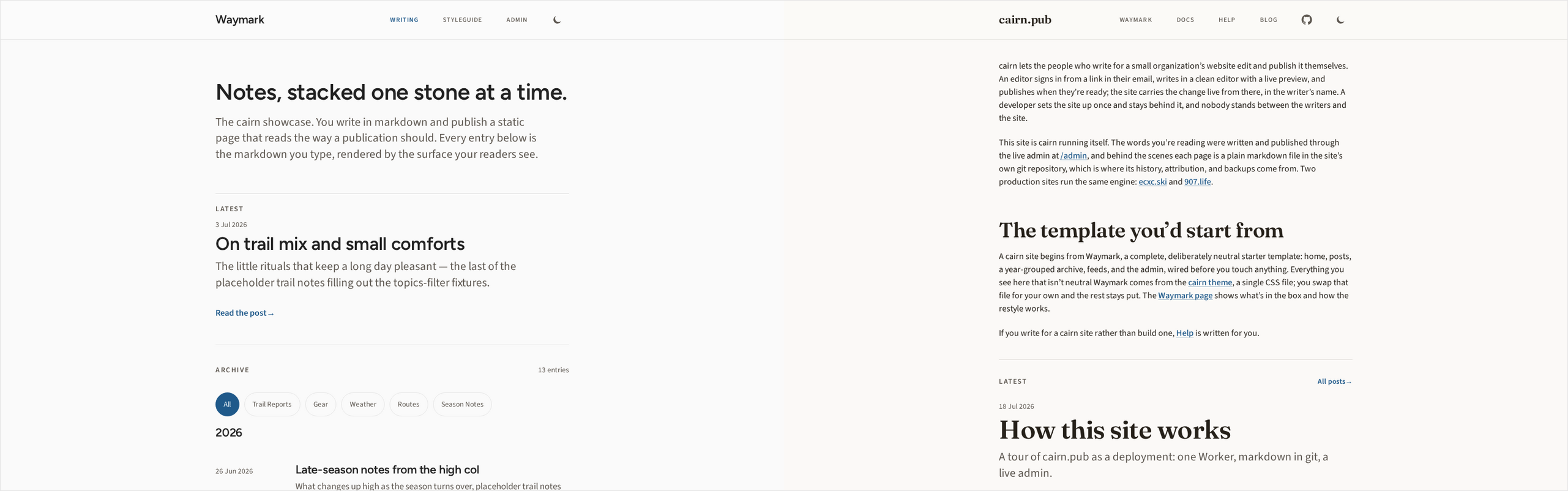
The arrangement is the restyle story told as a working example rather than a promise. Waymark’s surfaces read every color and size from tokens in one theme.css, so a re-skin edits tokens instead of hunting through components, and in the template’s own CI two gates hold the seam: one fails the build if a literal color sneaks onto the public surface, and one proves every shipped pairing clears the WCAG AA contrast floor, in both sRGB and display-P3.
Your site will not look like this one unless you want it to. Start at the Waymark page, see the neutral template, and read the restyle guide with the cairn theme open beside it as the worked example.